Behind the scenes with '24 hours in an invisible epidemic'
What we visualize when we visualize loneliness
Welcome to my very first Big Charts post! I’m devoting this newsletter to writing about how my stories come to be. My projects take a bit of time, so these posts will likely be sporadic.
Today I’m writing about a story published in the Pudding this week: 24 hours in an invisible epidemic.
This story started with my obsession with the American Time Use Survey. Each year, the survey asks tens of thousands of Americans to track one day of their lives. So you can zoom into one person and see what they did.
For example, here’s the diary of a 36-year-old man in 2012:
For most projects, the power of the American Time Use Survey is that it includes so many people. That means we can aggregate it and see how tens of thousands of people spend their time:
Occasionally someone will make a visualization that reminds you that this dataset tracks individual people. My favorite is this piece from Flowing Data’s Nathan Yau:
But I was captivated by the individual diaries. After reading a few dozen, I noticed a lot of diaries were kind of sad: 20-somethings trapped at work, 40-somethings responsible for five kids, and retired people who were completely isolated.
I wanted to know: Are they actually unhappy?
The American Time Use Survey added a well-being module for 2021, which asked people how they’re doing. The questions asked participants to imagine a ladder. If their best possible life is at the top (10) and worst possible life is at the bottom (0), where do they currently stand?

At this point, I thought my story was about the correlation between our day-to-day activities and our happiness.
My initial plan was to show the reader the aggregate large-scale analysis, and then let them zoom into the data to see visualizations of individual diaries. Here’s one of my first sketches:
So I started with a thorough analysis of the American Time Use Survey. I found that happier people report being healthier and more rested; they spend more time on leisure, education, personal care, and household activities; and they spend more time with other people.
I had some interesting findings!
Unfortunately, when I visualized the data, those findings weren’t apparent. In the chart below, the far left chart shows how the happiest people spend their time. The far right shows the unhappiest people. The charts mostly look the same!
This gets at one of the core challenges of data visualization: Sometimes you can find interesting findings in the data, but the visualization doesn’t clearly show those findings. And when you’re telling a visual story, that’s a problem.
So I started to wonder: Could I tell this story without actually showing you the aggregate data? Could I tell this story by centering individuals?
There was only one way to find out: By making the damn thing.
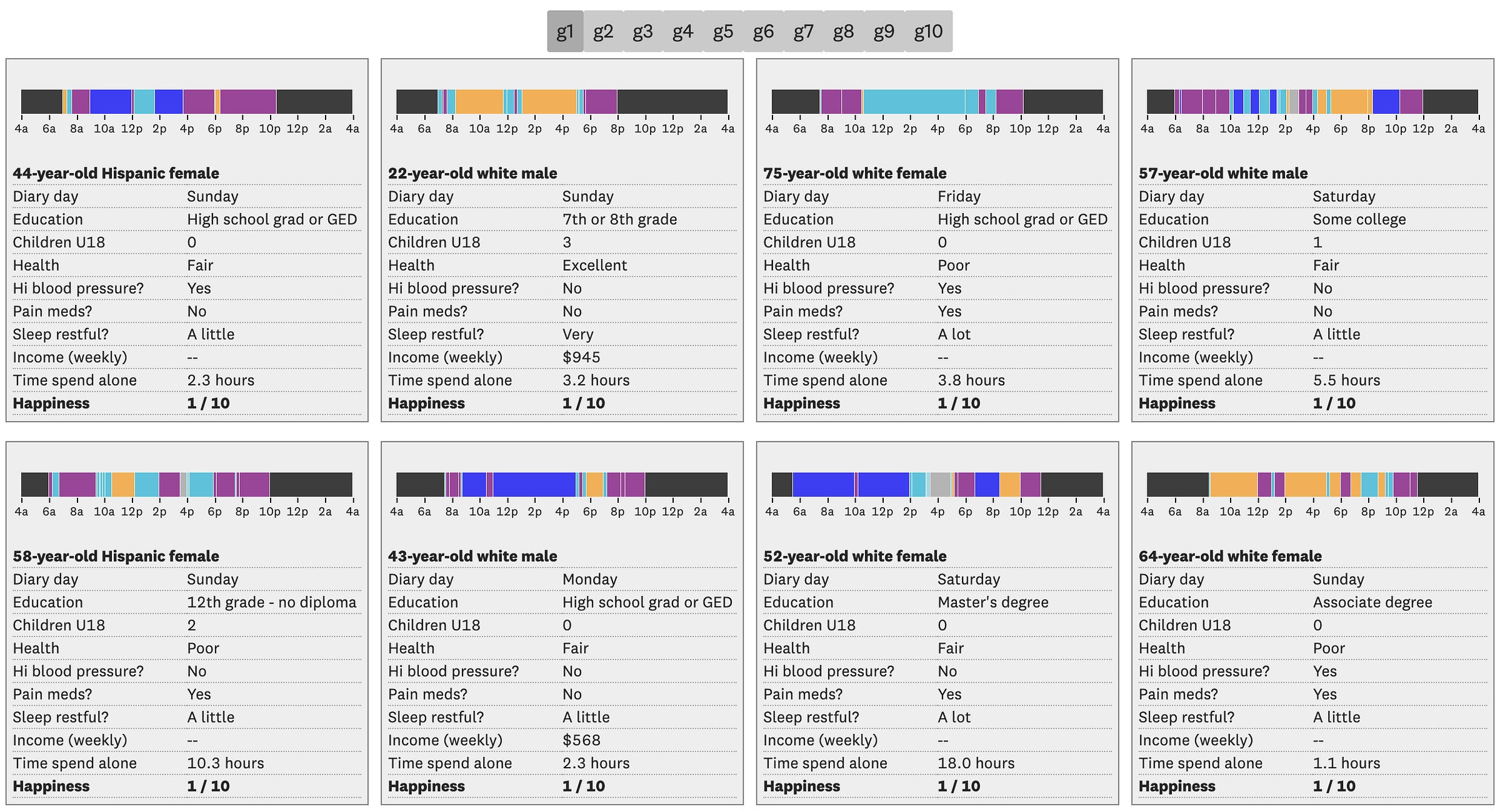
The first iteration of the interactive is below. Each box is a person, and inside the box is a timeline visualizing their diary activities, along with a bunch of demographic information. The toolbar at the top (g1, g2, g3) filter out people by where they are on the Cantril Ladder. So the screenshot below is only looking at people who report being a 1 out of 10 on the ladder.
The color-coded timeline was clearly the most compelling part of the graphic. But the problem was that, even after I grouped the activities, there were way too many colors. (My categories groupings were sleep, travel, work/education, household/consumer activities, and social/leisure activities.) That meant it was hard to understand.
So I started to wonder: What if it doesn’t actually matter what we do, but rather who we do it with?
I started by separating out social activities from individual activities. In the graphic below, the higher the bar on the timeline, the more “social” and activity is. Again, the toolbar at the top filters the people by where they are on the Cantril Ladder:

And that’s when I started to see the real story: When I looked at the people lowest on the ladder, their timelines looked so empty. When I looked at people higher on the ladder, the timelines were full of social interaction.
The ‘whoa’ moment and finding a north star
I went back to the data and looked at whether the amount of time we spend with other people has changed in the last few decades. First I looked at the time we spend with family. I gasped when I first saw this chart:
Then I looked at time spent with friends:
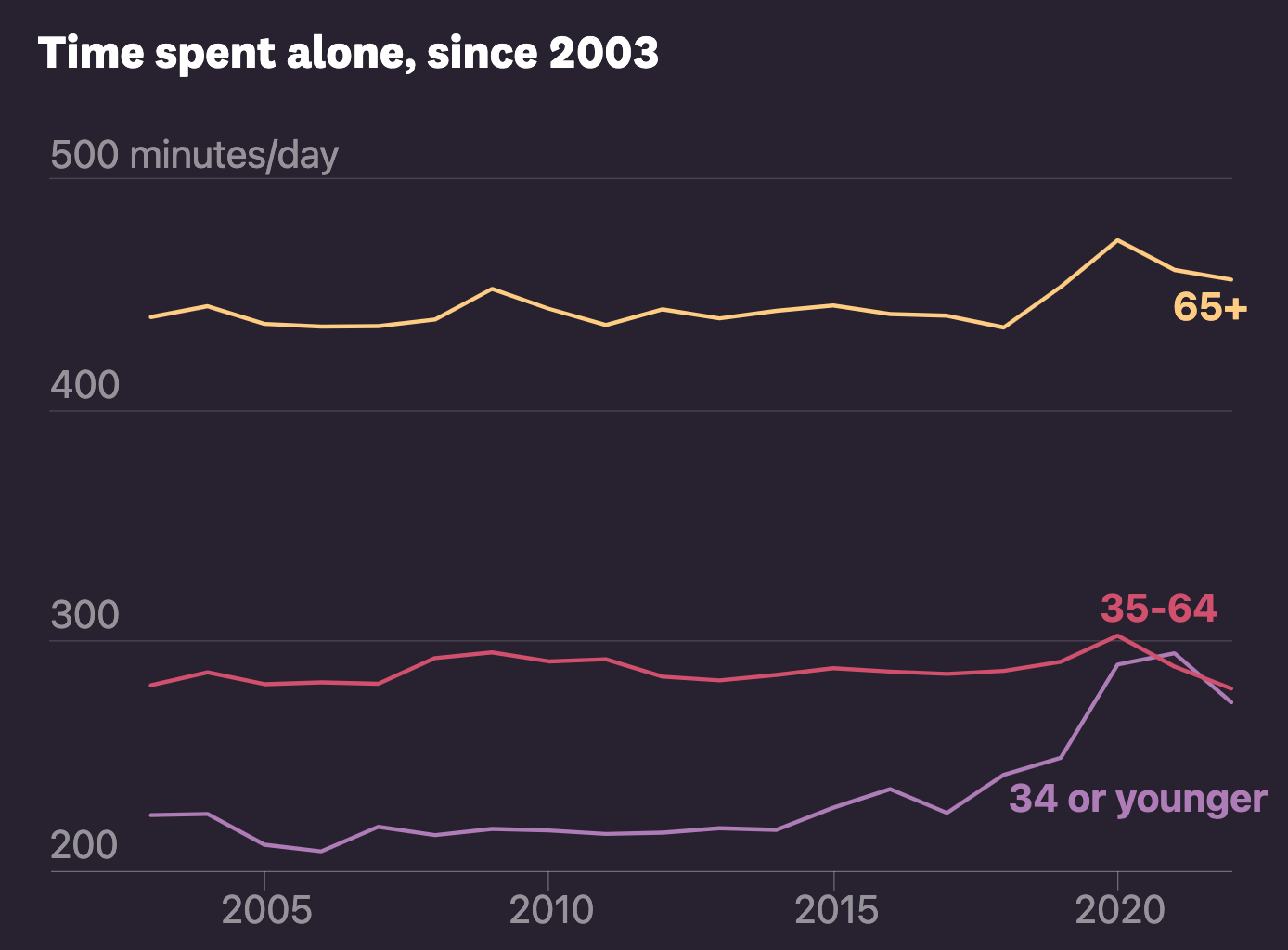
And finally, I looked at time spent alone:
I knew that health experts had warned about a “loneliness epidemic.” But I didn’t realize that, during my lifetime, we had gone through a dramatic shift in how we live our lives.
This finding also helped me focus my research. Along with some a bunch of academic research, I read handful of books to help me better understand the literature, including:
Together: The Healing Power of Human Connection in a Sometimes Lonely World, by Vivek Murthy (former US Surgeon General)
Loneliness: Human Nature and the Need for Social Connection, by John T. Cacioppo and William Patrick
Friends: Understanding the Power of our Most Important Relationships, by Robin Dunbar
Before this project, I had read a handful of stories about the so-called "loneliness epidemic.” But I didn’t realize that social isolation makes us more anxious, stressed, fearful, and angry. It robs us of our best selves. As Murthy writes in his book, it convinces us that maybe we’re not worthy of love.
I knew this on a personal level. I’ve spent long periods of my life struggling with loneliness and managing the debilitating emotions that come with it. Even now, they are the rawest, most private parts of my life. So trying to think of that feeling as a nationwide crisis was difficult.
But that tension also gave me a north star for this piece: I wanted to make something as personal as loneliness feel universal. And I knew I could do it by visualizing individual diaries.
The visual design: A ‘doll house’
This data was hard to visualize. That’s because there were so many parts of the data that I thought were important. For example:
The activities: My first instinct was to make a timeline, which flattens all 24 hours into a single visual. But as we saw before, that’s hard to do!
The social interaction: I also needed to show who people interacted with.
The demographics: I thought it was important to show some demographic information. It humanizes the visualization.
The Pudding team suggested that I make a “doll house” of people. That meant that I only had to focus on what someone is doing at a given time, rather than having to visualize the entire diary.
Immediately that made the concept click into place.
In my first draft, I started by making black bars to represent the person. And then I added gray bars to represent the people they spend their time with:
In my next iteration, I added demographic information, a description of what they’re doing at any given time, and I added their Cantril Ladder score on the left.
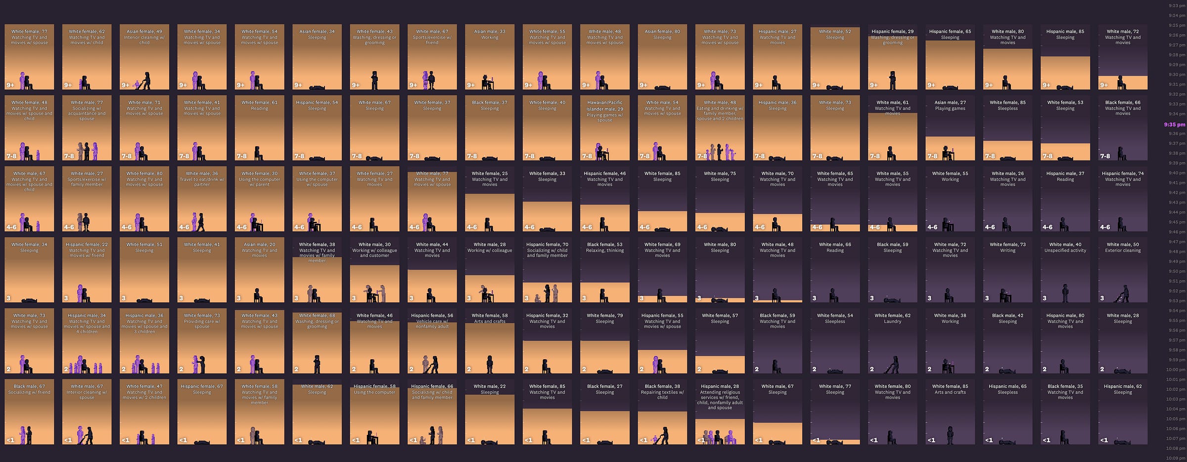
From there, I separated people out into happiness groups and started tracking each person’s cumulative social interaction time:

Initially the interactive played through one day automatically. It felt like the story was always going too fast or too slow. So I allowed the reader to scroll down to advance the time:
I was dreading the process of figuring out the animations. But I had an inkling that my best bet would be to use sprite animation – basically the technique that old-school video games use. I think of it as a digital flip book.
This fantastic Stack Overflow post helped me figure out how to do this:
This worked, so I embarked on making my own sprite sheet.
I made a huge list of activities that I needed to animate. And then I used Asperite to make each individual animation. From there, I wrote a shell script to combine all of the animations into this big sprite sheet. Here’s the result:
I pulled everything together and ended up with this:
Initially I wanted to get across the correlation between isolation and happiness by grouping the people by happiness level. Visually, you could kind of see it – but it wasn’t 100% apparent.
So eventually, I got rid of the groupings and created one massive grid of boxes:
From there, I rewrote the code so they could sort themselves by cumulative social interaction levels and Cantril Ladder score:
Technically and design-wise, this was the hardest part of the project. On the design front, I had to figure out how to show a trend on every screen size. On the coding side, I had to figure out how to sort the boxes and put them in the correct position. It would’ve been fine if the screen size stayed the same. But the code had to work for everything from my massive external monitor to an iPhone SE.
But I knew it was going to be a critical part of the storytelling. So… I spent many many hours making this work.
The screenshot above is from my 21:9 monitor. I think it’s beautiful (and I want to display it in some museum.) But it also works quite well on an iPhone screen:
Shaping the narrative
At this point, I could scroll through a day of the data and it looked pretty. But it still needed a narrative shape.
I knew I wanted to start the piece with one person, because it immediately makes the data feel human. I chose a 62-year-old man and nicknamed him “Martin”:
From there, I wanted a few “whoa” moment. The first one comes when I reveal the large grid of people:
The second comes when I start to track social interaction:
The third comes when the grid is reorganized based on the cumulative social interaction:
If we’re thinking about it from a news story perspective, starting with one person is the anecdotal lede. The reveal of all the people – plus some text that sign-posts where the story is going – is the nutgraf. And the top of the narrative arc is when the grid is reorganized. And throughout the piece, I wanted to keep reminding the reader that these are real people. So I kept coming back to Martin.
If we’re thinking about this from an information design perspective, each of these narrative beats is designed to add a little more information to the story without scaring the reader. Seeing all the data at once can be overwhelming. So I layer it on, one at a time. And I tried to seamlessly blend this information layering with the narrative storytelling. After all, they are different ways of talking about the same thing.
The story really started to come together when my partner, Amanda, told me that a lot of the writing felt dutiful and not necessary. I had done so much research that I felt like I had to show it off. But good editor tells you when you’re being selfish and not writing for the reader. So I cut all of that.
The personal vs. the universal
Visualizing information isn’t just a presentation tool. It’s also a tool to help us think.
Linguists argue that our perception of reality is shaped by language. So in my mind, data visualization is just a different language to think through reality. It’s a spatial way to organize my thoughts and tease out new ideas.
Early on, I had trouble writing about individual loneliness in the context of a loneliness epidemic. One felt so raw; the other felt so academic. Writing this post, I realized that my data viz exploration was actually an attempt to get my head around these concepts.
I’ve been incredibly touched by how people have responded to the piece. I’m learning that so many people quietly struggle with loneliness, and it’s a major factor in their day to day lives.
That’s partially why I ended this piece with a personal point of view. Every time I tried to be prescriptive, it didn’t seem genuine. But I found that when I told someone I was working on a piece about loneliness, they almost always told me about their struggles with loneliness. All that is to say, I hope the piece has prompted some of these conversations for you.
Thanks to the Pudding for all the support and the opportunity to work on a piece that is meaningful to me. Thanks for my partner Amanda for the edits. And thanks to all the folks who have reached out with kind words.


