I recently published a piece in the Pudding called This is a teenager. This post is about how the piece was done, so it might be useful to read the story before you read this.
I’m often asked how long a project takes and what that process looks like. I usually give a vague answer like, “Probably a total of four weeks, spread across several months.” But I always knew that was a bullshit answer, because time is actually a really bad measure for what it takes to finish a project.
So this time, I kept a diary of what I did every single day I worked on this project.
Fall 2023: Inspiration
A few years ago, I started teaching full-time at the New School after being an adjunct for many years. As I spent more time on campus, I witnessed small life events derailing students’ lives.
It often started with something as small as getting sick and missing a few classes. That quickly snowballed into losing a job, getting overwhelmed with school work, or experiencing a mental health crisis. For some, that meant dropping out of school, which meant they had loads of debt without a degree. While their classmates graduated and worked fulfilling jobs, their lives stalled as they figured out their place in the world.
So I decide to start thinking about this question as a data journalist.
Winter 2023: Getting to know the data
I’ve committed to working with the Pudding on a more regular basis. My start date is January 1, so I do some data exploration to get prepared for my next Pudding story.
I’ve long known about the National Longitudinal Survey of Youth. It’s a survey that follow people throughout their life, starting from their teenage years. There is a lot of data here – questions about family, school, work, life, health, relationships, and more. Most importantly, this data let’s me track people’s experiences and outcomes over time.
There is one cohort of people that this survey started following in 1979, so that group is now in their 50s. And there’s another cohort that the survey started following in 1997, and that group is now in their late-30s. I chose the latter, since their experiences reflect the current reality much more closely.
Longitudinal data can be pretty intimidating to work with. The Bureau of Labor Statistics actually has a portal that lets you create a subset of the data and download it. But there’s a learning curve – and I’m saying that as someone who works with data all the time. That said, once you understand how to access and understand the data, it yield an incredible amount of information.
January 2: Data download
I learn how to use the data download portal, read up on the documentation, and load the data into a Jupyter notebook so I can analyze the data in Pandas.
January 3: Data analysis
I write two scripts to analyze the data. One of them let’s me see one person at a time, just so I get a feel for what one datapoint looks like. The other analyzes the full dataset so I can see what’s happening with the full cohort.
I can see college students getting derailed in the data, but I’m enamored with the data on childhood variables – like parenting style, family/home environments, first dates, attitudes on school, SAT scores, whether they were bullied, and more. So I’m exploring the possibility of a pivot.
January 4: Visualization sketches
I have an idea of how I want to visualize this data. When I teach data journalism, I have students stand up and group themselves by various traits – maybe it’s their age, where they’re from, or their favorite music genre. From there, I have them calculate something within their groups – average number of steps taken each day, average number of books read this year, average number of Instagram followers. It turns the students into datapoints, so they can experience data analysis with their bodies, rather than in a spreadsheet.
With that in mind, my initial plan is to visualize the data with people running around the screen and grouping themselves:
January 5-18: Setting up the interactive
Over the next few days, I start setting up the interactive code. I connect the data to the app and set up a scrolly interface.
I decide that, in order to have these people run around the screen in the way I want, I’m going to use P5.js. This is a library that is basically the Javascript version of a programming language called Processing. It’s a coding language geared toward visual artists, and it has a special place in my heart because I learned Processing during grad school at NYU ITP. Thanks to Professor Dan Shiffman (who has an amazing YouTube channel, Coding Train), I learned how to code a crude physics engine to have my people icons run across the screen exactly how I want them to. If you’re interested in learning, read this.
Meanwhile, I’m still playing with the data. I’m realizing at this stage that I want to see the data visualized, rather than just seeing it analyzed in Pandas. But how should these people be grouped? Well, my initial thought is that they should be grouped based on whether they are in high school, college, or working.
Below are some working sketches. Notably, they aren’t wireframes. They are just me thinking through some ideas on paper.
January 19: Exploring data with visuals
I’m still playing around with data in my Jupyter notebook. But I also want to see what I can see in the data.
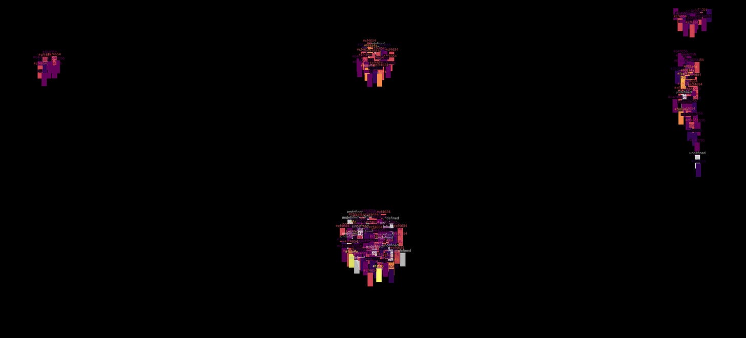
Right now I’m having rectangle fly around the screen and group themselves. I’m coloring them in by what I’m calling a “derailment index." But the conclusion is that I can’t see anything in the data with this current design.
Soon I will property organize the people on the screen so I can see what’s happening.
January 23: Honing the visual structure
I think this reorganization worked!
January 24: Honing the physics
One big issue was that, when the rectangle fly around the screen, they don’t smoothly arrive at the intended destination. Instead it flies past it. So I fixed that code, and now the animation looks good.
January 25: The desert. Ugh.
During every big project, I experience what I call “The Desert.” It’s when I questions everything about my project, my abilities, and my career path. It’s when I can’t see the light at the end of the tunnel. Everything feels broken. And it doesn’t feel good.
But I’ve done this enough times to know that The Desert is a normal part of the process.
Today is the start of The Desert.
I woke up this morning feeling a bit uneasy about this story… because I don’t actually have a clear story here. So I spend the day fleshing out the story, and I think I have a new idea.
It’s called “The Great Equalizer” – and it’s about how the education system actually exacerbates inequality. It’s a common theme in my work, so perhaps this is playing it safe.
Anyway, the idea is to have two groupings of icons: people in school and people in the workforce.
Part 1: Let the reader scroll through 20-some years and see people on the screen getting more and more education, and sort them by educational attainment. When they go into the workforce, sort them by income or happiness or health.
Part 2: Go back in time. Let the reader scroll through again. But this time, color it in by something else out of the kid’s control – maybe parental education level? Or family wealth?
Still not sure how I feel about this.
January 29: Still walking through The Desert
There is a lot of data.
There are 9,000 people in the data. Each person is tracked for 24 years. And each year, I grabbed hundreds of datapoints.
So I spend the day getting my head around how to organize the data. I eventually decide that, for each person, my data structure will be something like this:
[
// 1997
[0, 8.0, 0, 500.0, 14.0, 61.0, 85.0, -1, -1, -1, 0.0, 1.0, -1, -1, 1.7, 0, 0, 0, 0, 0, 0, 0, 0, 0, 0, 1.0, 0, -1, 27006.0, 1.0, 1, 1],

// 1998
[0, 9.0, 0, 500.0, 15.0, 67.0, 112.0, -1, -1, -1, 0.0, 2.0, -1, -1, 170.0, 0, 1, 0, 0, 0, 0, 0, 0, 0, 0, 1.0, 0, -1, -4.0, 2.0, 1, 1],

...
]
Once I get my head around the data, it isn’t bad at all.
January 30: In the middle of The Desert
I still feel a bit uncertain. I think I know what the story is. I think I know what the video is. (Oh, right, did I tell you I’m making a video, too?) But... sometimes it's tough to tell until you put it on the screen. I suppose I have faith it will work out. I have an exciting plan. But it doesn't feel like I'm refining yet. It feels like I'm still conceptualizing. I feel like I’m in the desert.
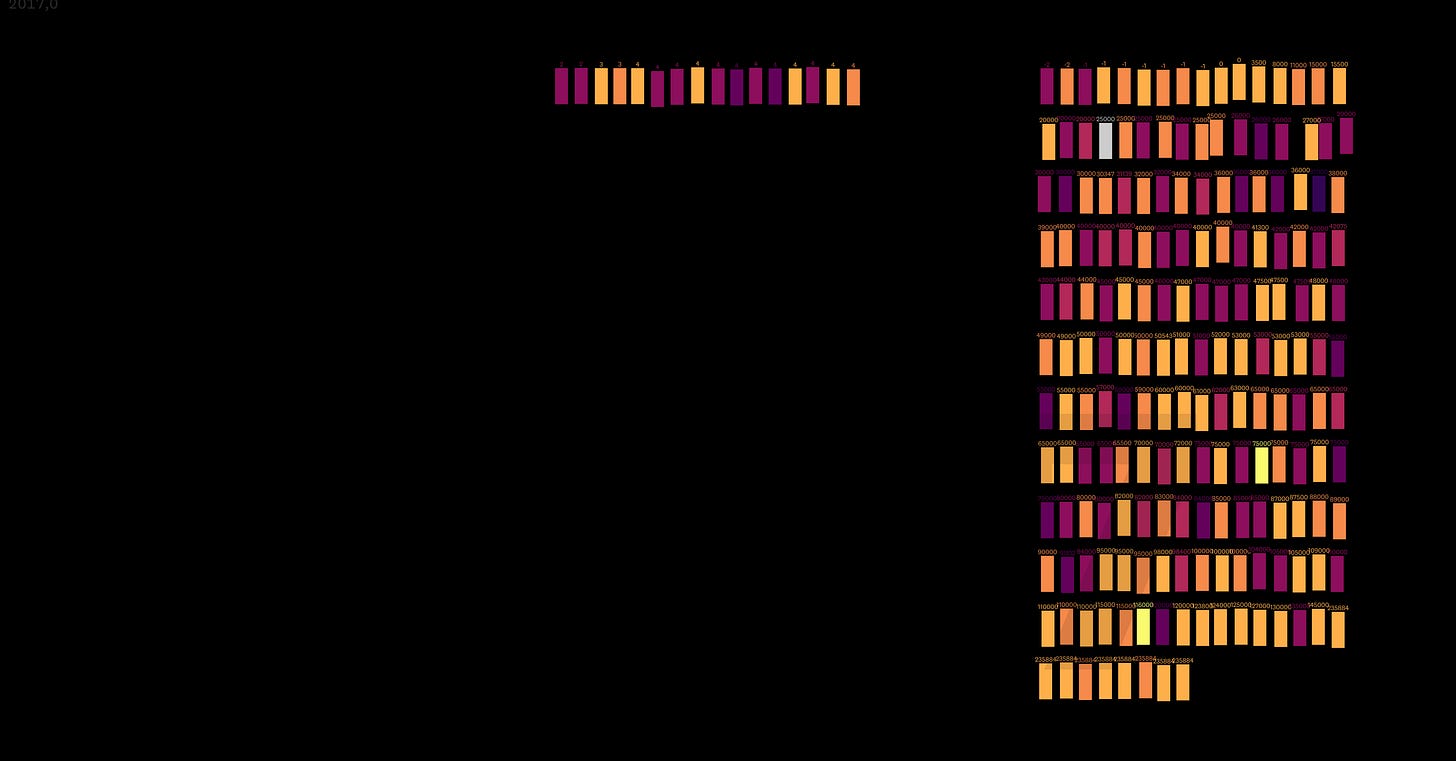
By the end of the day, I have something that looks like this:
I’m able to see the data more clearly. Still don’t know if I have a good story.
February 1: Figuring out the visual structure
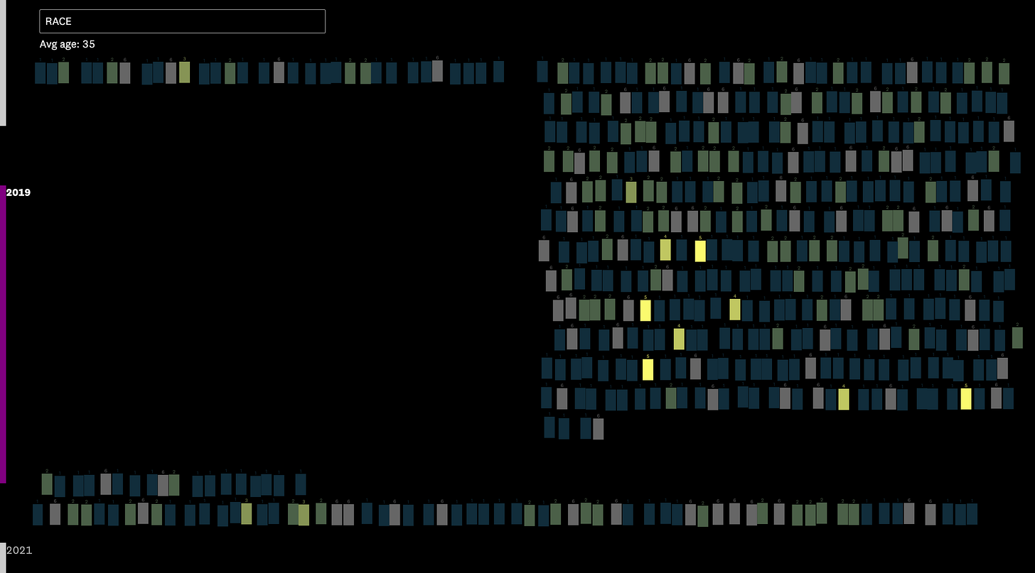
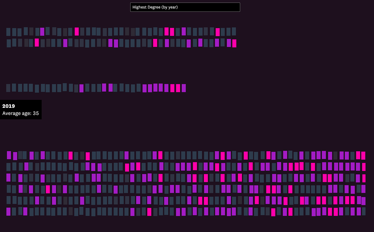
I have a three-column layout working. The first column is high school, the second is college, the third is work, and at the bottom are the “leftovers” – the people who aren’t engaged in any of the above.
A little more tweaking:
February 2: Cleaning up visuals, avoiding the big problems
I feel good about where I am! Am I out of The Desert? (Spoiler alert: I was not.)
February 3: Figuring out technical things, still ignoring the story
I wanted to test out sprites in P5.js. So I used a sample from here. It works!
I used this sample code (also from Dan Shiffman) to get me started. This helped me figure out what kind of sprites I needed to animate the people smoothly.
February 5 to 9: Figuring out design, still ignoring story
I come up with a color palette:
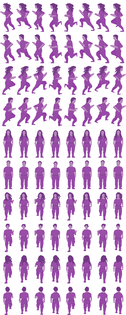
I make a list of all the sprite I need to make.
[yellow, orange, red, lightpurple, purple, darkpurple, blackpurple, no data]
[male, female]
[running left, running up, running down, standing]
I draw all these sprites in Aseprite. I spend a lot of time making these.
My first attempt is terrible.
Notably I also teach two of these days, so I’m a bit tired from doing work constantly. But… it pays off! Here’s one of the sprite sheets:
Here are the sprites on the page:
February 12 to 19: Figuring out UI + tech, ignoring story… still
I want to clean up the interface as much as possible. Normally this would be annoying, but given that this is the only easy thing left in the project, it’s a bit relaxing to clean up code, clean up design, and write some code to automate several parts of the project.
One thing I automate is the ability to add new variables to the data.
Another thing I add is the ability to use the Google Doc to drive the entire story. What that means is that, when I work on the story, I can work entirely in Google Docs and not at all in the code. Being able to just focus on story – and not code is huge. (It uses ArchieML to parse this into a Javascript array of objects.)

I also realize that I need to go back and get some more data from the National Longitudinal Survey of Youth. I missed some columns about home/family environment risk and mental health. So I begrudgingly go back and get that data.
End of February: Time to get out of The Desert
I decide I need to do the thing I’ve been putting off: Figure out the damn story. I’ve done this before, so it isn’t too daunting.
I read a bunch of research on everything from emerging adulthood to derailment to resilience.
I go back to my data to see if any of these themes are apparent.
When I see some themes, see if it’s visible in the data. (Sometimes it’s easy to see something in the data but hard to see it in the visualization.)
Going through this process helps me realize something: What I see in the data is that derailment – and getting “left behind” – is real. But what’s more apparent is how kids get left behind much earlier in life, based on circumstances out of their control.
About a decade ago, I helped my colleague, Arielle Levin Becker, with a story on the long reach of childhood trauma while working at the Connecticut Mirror. (Sorry the page is somewhat broken; that’s my fault.) First of all, it’s an incredible story. Secondly, it helps me realize that the big story in my data is how childhood and teenage experiences play a huge part in shaping our adult lives. I’d read a lot of literature on these stressors and traumas – Adverse Childhood Experiences – but didn’t realize that’s what I was looking at in the data.
It was devastating to see kids growing up in difficult environments. They were mostly optimistic about the future, which told me that they assumed they’d eventually have the agency to better their lives. But the research showed that our adult outcomes are largely shaped by our childhood experiences.
Then, when they turn 18, we punish them if they’re poor, hungry, unhealthy, uneducated, etc.
March 1 to 7: Refocusing the story
I have a new idea. The start begins with something like: “Once upon a time, there was an optimistic kids…”
I’m attached to the idea that most of these kids are optimistic, but their lives don’t quite turn out the way they’d hoped.
I write through a new version of the story.
March 11: A good editor tells me it’s confusing
My partner, Amanda, is a great editor. So I have her take a look, and she gives me some honest feedback on things that don’t work. The summary is: A lot of this story is confusing, and there’s way too much happening.
March 12: Further focusing the story
My takeaway from the feedback is that I need one clear and concise point, and I need each part of the story to reiterate that point. So what is the point?
Here’s what I come up with: These are teenagers, and we've created a world where it's their fault for failing when they grow up. But the evidence shows that their futures are shaped by the environment we put them in when they're kids.
I rewrite the story.
March 13 to 15: Feedback from the Pudding team
The Pudding team gives me feedback. Like I mentioned for my previous piece, they give great feedback.
I clean up a bunch of UI issues. I clean up a bunch of accessibility issues. I clean up a bunch of code.
March 16: Debugging and cleaning up
I clean up a bunch of mobile issues.
I clean up a bunch of small bugs.
I have a final version that looks pretty good.
March 17: Adding a last-minute feature
I decide it’s a good idea to allow the user to click on each person to see details. I spend my Sunday morning building out this feature.
March 18 to 31: Scripting the video and prepping the video animations
I start working on the video. I’ve already been thinking about it, so this isn’t a huge lift.
I first write through a script. (I worked on the Vox video team, so I just defaulted to the process we used there. I have some ideas of how I want to change my process for next time… but more on that next time.)
What I’m especially excited about is a version of the interactive that generates out huge portions of the video. It’s essentially an app that runs through a script, with my preferred timings. I also have an interface that lets me override the script.
April 1 to 8: Motion graphics and video editing hell
I track the voiceover. I spend time in motion graphics hell, aka After Effects. And I edit the video together in Premiere. I source music, sound effects, and some stock footage. (This is notably harder outside of a big newsroom.)
I was super busy, so I didn’t do a great job documenting this.
April 9: Publication
Publication date.
The video was the last thing out the door. I need to figure out a better process for producing an interactive piece and a video piece at the same time.
Final thoughts
The piece published this morning. I have no idea whether it’s good. This is how I usually feel about my pieces.
As for how long this took: It was at least two days a week for about three months.
When I think back on the last few months, I think this process had more twists and turns than most projects because I didn’t want to confront that I didn’t have a clear story. This is partially because I started with one focus and pivoted halfway through. But it’s also because there were parts of this project that were technically difficult or time-consuming, and I was more worried about those things than actually figuring out the story. It’s something I tell warn my students about constantly. But I didn’t heed my own advice.
That said, I try not to be too prescription about “process.” We all have different ways of working and, more importantly, different ways of thinking through our ideas. Over time, we go through bumps, we hear from smart people, and we refine and improve our process.
Thanks for reading and subscribing. I really appreciate it.








I'm in the desert! It's really helpful to know that you can name the struggling process. Also, even someone so smart and creative like you would still struggle. That endeavor made the story more invaluable.
I read the interactive story on Pudding and I loved how you used "Alex" as the anchor to talk about such a complex issue. Now reading about your process I'm even more inspired. Thank you so much for this work!